
EpigenPlot is a web tool for exploring methylation data from 2,346 colorectal and 3,377 breast samples. It analyzes beta values, which measure the degree of DNA methylation (0 = unmethylated, 1 = fully methylated).
Please cite kindly cite our paper to support further development: Muller, D., & Gyorffy, B. (2025). EpigenPlot: An interactive web platform for DNA methylation-based biomarker and drug target discovery in colorectal cancer., British Journal of Pharmacology (BJP), https://doi.org/10.1111/bph.17455
Copyright: Department of Bioinformatics, Semmelweis University 2021-2025
Check our other webtools: https://tnmplot.com ; http://www.kmplot.com ; http://www.rocplot.com ;
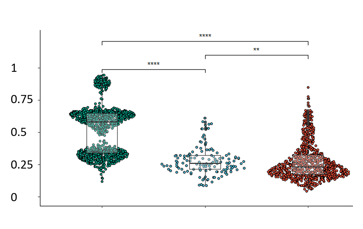
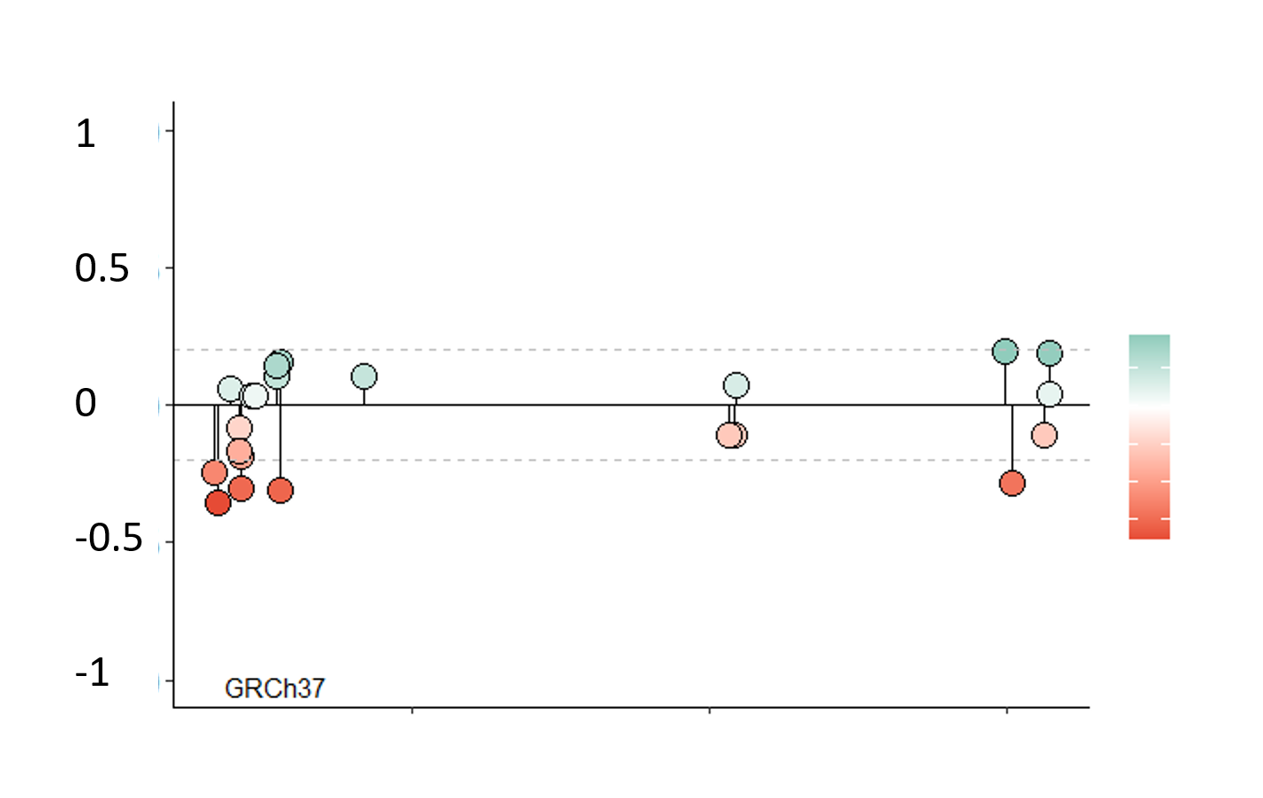
Choose a gene and a region and push the "Create plots" button in order to visualize methylation changes. The first plot includes a boxplot comparing β values of different tissue types, while the second one the difference between normal and adenocarcinoma values by percentiles.
Loading input options...
Normal reference for tumor comparison
All tumor samples are always included. Choose which normal cohort is used as the reference (FST
Disease
:
healthy
= healthy donors;
tumor
with normal histology = adjacent normals).
Choose inputs and click Create/Refresh plots.
Percentile plot appears after you create plots.
Choose a gene to visualize all methylatable sites in a lollipop plot. Use the slide to narrow down the analyzed chromosome section. Use the cursor to select CpG-sites. Information of the selected site(s) will appear(s) in the table.
Normal reference for tumor comparison
All tumor samples are always included. Choose which normal cohort is used as the reference in Δβ and plots.
Choose a gene and click Create plot. The chromosome interval slider updates when the plot loads.
Choose inputs and click Create plot.
Choose a region and a KEGG pathway and push the "Create plots" button in order to visualize the difference between β value means of the genes associated with the selected KEGG pathway (human only). On the created comet plot, the end of the comet tail represents the mean of β values in normal, while the head represents the mean of β values in adenocarcinoma tissues. If there are more than 20 genes associated to the pathway, only the first N (default N = 20) with the most significant difference will be included in the plot. Difference in case of all genes will be shown in the table.
Normal reference for tumor comparison
All tumor samples are always included. Choose which normal cohort is used as the reference in Δβ and pathway summaries.
Choose inputs and click Create plot.
Select up to 25 genes (space-separated) and push the "Create plot" button to visualize the difference between β value means across gene regions. The heatmap shows tumor β minus normal β for each gene and region.
Normal reference for tumor comparison
All tumor samples are always included. Choose which normal cohort is used as the reference in Δβ and heatmaps.
Enter gene names and click Create plot.
Explore correlation between DNA methylation and gene expression data from TCGA breast cancer samples. The table shows Spearman correlation coefficients (spearman_rho) by gene regions.
Enter gene names and click Show correlation data.
Sample applications
Posters with analysis performed using EpigenPlot (click to expand).
Gene regions and statistics
Gene regions with significant differential methylation (p < 0.001, Kruskal-Wallis and β >= 0.2) with 5-fold cross-validated AUC and statistics. See the description of column names in the first table tab.
DownloadStuck? Check out our youtube video!
What kind of data is EpigenPlot based on?
EpigenPlot is a platform for user-friendly methylation data analysis. It facilitates the analysis of a curated dataset based on publicly available methylation data. The dataset includes data from two Illumina microarray platforms: IlluminaHumanMethylation450K (HM450K) and IlluminaHumanMethylationEPIC (EPIC).
What does beta value mean?
Methylation is shown in beta values representing a ratio of methylated and unmethylated signals. Beta values lie between 0 and 1 and are positively correlated with the extent of methylation.